My first visit to Renegade Craft Fair was awe-inspiring. So many people, so many handmade goods, so little time. I gave myself 3 hours ( on the parking meter) and I still didn’t see everything.
One of the reasons I decided to go to Renegade Craft Fair was to check out the craft fair scene. What would it take for Moonish Goods to be a seller there. I knew that I wanted to see how vendors arranged their booths, and displays, and how they tied it all together with their brand/style. But what I hadn’t realized was how many items you have to stock for an event this large. Two full days from 11-7pm. And those things have to stand out from the hundreds of other vendors, an the several who may be selling items similar to yours. Lots to think about.
Meanwhile, I did take some photographs of booths and displays that stood out to me. Check them out below:
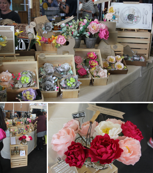
One of the booths I admired was Ji Kim’s paper flower shop Blooms In The Air. I thought she did a good job of displaying the flowers in different and interesting ways. Flowers with stems were in buckets like at a flower stand, and flowers with peelable sticker backs packed in produce containers. I also appreciated that were examples of the flowers in use so that she could easily point to the examples when the inevitable question arose.
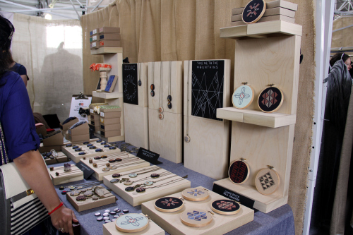
I liked Zelma Rose‘s display (not to mention her necklaces) using cradled art boards to create sections and organize different items. The tall displays and shelves are also made of cradled boards. Nice and DIY.
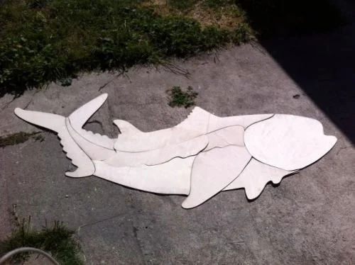
I’ve seen Tina Produce‘s packaging before on Etsy, but I still think using the berry baskets and crates is genius.
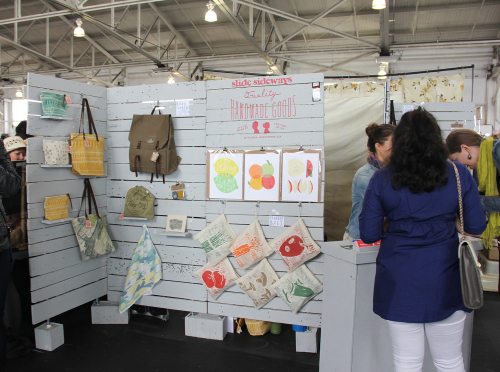
Slide Sideways did a great job of using their corner space. They set up a wall of, well, slat wall around the corner, with a check out counter at the apex. I loved their nature patches.
There were so many more amazing booths and handmade art and products. Will definitely be back next year!
